How to better create stacked bar graphs with multiple variables from ggplot2?
Posted
by deoksu
on Stack Overflow
See other posts from Stack Overflow
or by deoksu
Published on 2010-04-05T14:46:15Z
Indexed on
2010/04/05
19:43 UTC
Read the original article
Hit count: 641
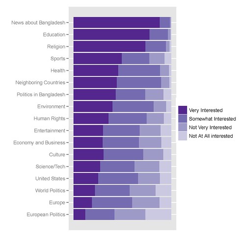
I often have to make stacked barplots to compare variables, and because I do all my stats in R, I prefer to do all my graphics in R with ggplot2. I would like to learn how to do two things:
First, I would like to be able to add proper percentage tick marks for each variable rather than tick marks by count. Counts would be confusing, which is why I take out the axis labels completely.
Second, there must be a simpler way to reorganize my data to make this happen. It seems like the sort of thing I should be able to do natively in ggplot2 with plyR, but the documentation for plyR is not very clear (and I have read both the ggplot2 book and the online plyR documentation.
My best graph looks like this, the code to create it follows:

the R code I use to get it is the following:
library(epicalc)

### recode the variables to factors ###
recode(c(int_newcoun, int_newneigh, int_neweur, int_newusa, int_neweco, int_newit, int_newen, int_newsp, int_newhr, int_newlit, int_newent, int_newrel, int_newhth, int_bapo, int_wopo, int_eupo, int_educ), c(1,2,3,4,5,6,7,8,9, NA),
c('Very Interested','Somewhat Interested','Not Very Interested','Not At All interested',NA,NA,NA,NA,NA,NA))

### Combine recoded variables to a common vector
Interest1<-c(int_newcoun, int_newneigh, int_neweur, int_newusa, int_neweco, int_newit, int_newen, int_newsp, int_newhr, int_newlit, int_newent, int_newrel, int_newhth, int_bapo, int_wopo, int_eupo, int_educ)


### Create a second vector to label the first vector by original variable ###
a1<-rep("News about Bangladesh", length(int_newcoun))
a2<-rep("Neighboring Countries", length(int_newneigh))
[...]
a17<-rep("Education", length(int_educ))


Interest2<-c(a1, a2, a3, a4, a5, a6, a7, a8, a9, a10, a11, a12, a13, a14, a15, a16, a17)

### Create a Weighting vector of the proper length ###
Interest.weight<-rep(weight, 17)

### Make and save a new data frame from the three vectors ###
Interest.df<-cbind(Interest1, Interest2, Interest.weight)
Interest.df<-as.data.frame(Interest.df)

write.csv(Interest.df, 'C:\\Documents and Settings\\[name]\\Desktop\\Sweave\\InterestBangladesh.csv')

### Sort the factor levels to display properly ###

Interest.df$Interest1<-relevel(Interest$Interest1, ref='Not Very Interested')
Interest.df$Interest1<-relevel(Interest$Interest1, ref='Somewhat Interested')
Interest.df$Interest1<-relevel(Interest$Interest1, ref='Very Interested')

Interest.df$Interest2<-relevel(Interest$Interest2, ref='News about Bangladesh')
Interest.df$Interest2<-relevel(Interest$Interest2, ref='Education')
[...]
Interest.df$Interest2<-relevel(Interest$Interest2, ref='European Politics')

detach(Interest)
attach(Interest)

### Finally create the graph in ggplot2 ###

library(ggplot2)
p<-ggplot(Interest, aes(Interest2, ..count..))
p<-p+geom_bar((aes(weight=Interest.weight, fill=Interest1)))
p<-p+coord_flip()
p<-p+scale_y_continuous("", breaks=NA)
p<-p+scale_fill_manual(value = rev(brewer.pal(5, "Purples")))
p
update_labels(p, list(fill='', x='', y=''))
I'd very much appreciate any tips, tricks or hints. Thanks.
© Stack Overflow or respective owner