Increasing touch surface (#wp7dev)
Posted
by Laurent Bugnion
on Geeks with Blogs
See other posts from Geeks with Blogs
or by Laurent Bugnion
Published on Sun, 12 Dec 2010 00:24:19 GMT
Indexed on
2010/12/12
6:22 UTC
Read the original article
Hit count: 535
When you design for Windows Phone 7 (or for any touch device, for that matter, and most especially small screens), you need to be very careful to give enough surface to your users’ fingers. It is easy to miss a touch on such small screens, and that can be horrifyingly frustrating. This is especially true when people are on the move, and trying to hit the control while walking and holding their device in one hand, or when the device is mounted in a car and vibrating with the engine.
In my experience, a touch surface should be ideally minimum 60x60 pixels to be easy to activate on the Windows Phone 7 screen (which is, as we know, 800 pixels x 480 pixels). Ideally, I try to make my touch surfaces 80x80 pixels minimum. This causes a few design challenges of course.
Using transparent backgrounds
However, one thing is helping us tremendously: some surfaces can be made transparent, and yet react to touch. The secret is the following:
- If you have a panel that has a Null background (i.e. the Background is not set at all), then the empty surface does not react to touch.
- If however the Background is set to the Transparent color (or any color where the Alpha channel is set to 0), then it will react to touch.
Setting a transparent background is easy. For example:
<Grid Background="#00000000">
</Grid>
or
<Grid Background="Transparent">
</Grid>
In C#:
var grid = new Grid
{
    Background = new SolidColorBrush(
        Colors.Transparent)
};
Using negative margins
Having a transparent background reactive to touch is a good start, but in addition, you must make sure that the surface is big enough for my clumsy fingers. One way to achieve that is to increase the transparent, touch-reactive surface, and reposition the element using negative margins.
For example, consider the following UI. I changed the transparent background of the HyperlinkButton to Red, in order to visualize the touch surface.
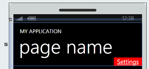
In this figure, the Settings HyperlinkButton is 105 pixels x 31 pixels. This is wide enough, but really small in height and easy to miss. To improve this, we can use negative margins, for instance:
<HyperlinkButton Content="Settings"
    HorizontalAlignment="Right"
    VerticalAlignment="Bottom"
    Height="60"
    Margin="0,0,0,-15" />
Notice the usage of negative bottom margin to bring the HyperlinkButton back at the bottom of the main Grid’s first row, where it belongs. And the result is:
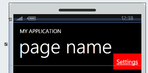
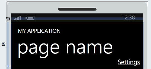
Notice how the touch surface is much bigger than before. This makes the HyperlinkButton easier to reach, and improves the user experience. With the background set back to normal, the UI looks exactly the same, as it should:
In summary:
- Remember to maximize the touch surface for your controls.
- Plan your design in consequence by reserving enough room around each control to allow their hit surface to be expanded as shown in this article.
- Do not cram too many controls in one page. If REALLY needed, use an additional page (or even better: use a Pivot control with multiple pivot items) for the controls that don’t fit on the first one.
This should ensure a smoother user experience and improved touch behavior.
Happy coding!
Laurent
© Geeks with Blogs or respective owner