Twitter Bootstrap: How to use containers and rows
Posted
by
StackOverflowNewbie
on Stack Overflow
See other posts from Stack Overflow
or by StackOverflowNewbie
Published on 2012-10-20T04:58:27Z
Indexed on
2012/10/20
5:00 UTC
Read the original article
Hit count: 362
Assume the following layout:
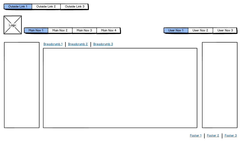
I'm trying to learn how to use Twitter's Bootstrap. What should the general structure of the framework's markup be? Is it this:
<div class="container-fluid">
   <div class="row-fluid">
      <div class="span12">
        // Outside link mark up here
      </div>
   </div>
</div>

<div class="container-fluid">
   <div class="row-fluid">
      <div class="span1">
        // Logo mark up here
      </div>
      <div class="span4">
        // Main nav mark up here
      </div>
      <div class="span3 offset4">
        // User nav mark up here
      </div>
   </div>
</div>

<div class="container-fluid">
   <div class="row-fluid">
      <div class="span3">
        // Left sidebar mark up here
      </div>
      <div class="span6">
         <div class="span6">
            // Breadcrumb mark up here
         </div>
         <div class="span6">
            // Main content mark up here
         </div>
      </div>
      <div class="span3">
        // Right sidebar mark up here
      </div>
   </div>
</div>

<div class="container-fluid">
   <div class="row-fluid">
      <div class="span3 offset9">
        // Footer link mark up here
      </div>
   </div>
</div>
© Stack Overflow or respective owner