How Google Web Starter Kit serves adaptive image for mobile?
Posted
by
5argon
on Pro Webmasters
See other posts from Pro Webmasters
or by 5argon
Published on 2014-08-17T07:57:01Z
Indexed on
2014/08/21
10:31 UTC
Read the original article
Hit count: 463
My website weirdly (in a good way) serves smaller images when viewed on mobile. I wanted to know what cause this? As far as I know this is not the default behaviour, so I think it must be Google Web Starter Kit's doing.Here is the debug information when debugging on device. All images became 231 B size no matter how large it actually is. (On desktop debugging the size varies.)
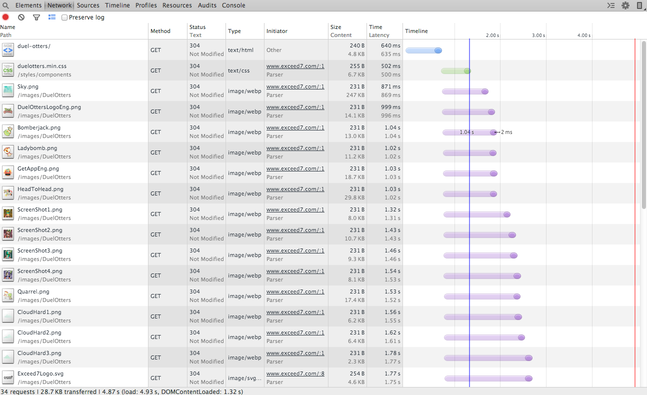
I tried using Google Web Starter Kit (https://github.com/google/web-starter-kit) recently. The tools in it are made of Ruby, Node.js, SASS and Gulp to help you 'build' website. Pre-build you can enjoy automatic reload because the Gulp script will watch all files for you. When build it will run various tools to minify HTML,CSS and compress images.
According to this page https://developers.google.com/web/fundamentals/tools/build/build_site the gulp-imagemin was used. So I guess the imagemin is doing the mobile optimization for me? What kind of compression can serve automatically resized image on mobile? And why is the size 231 B? Is this related to my screen size?
© Pro Webmasters or respective owner