Working with PivotTables in Excel
Posted
by Mark Virtue
on How to geek
See other posts from How to geek
or by Mark Virtue
Published on Mon, 22 Mar 2010 15:00:00 +0000
Indexed on
2010/03/22
15:21 UTC
Read the original article
Hit count: 1149
PivotTables are one of the most powerful features of Microsoft Excel. They allow large amounts of data to be analyzed and summarized in just a few mouse clicks. In this article, we explore PivotTables, understand what they are, and learn how to create and customize them.
Note: This article is written using Excel 2010 (Beta). The concept of a PivotTable has changed little over the years, but the method of creating one has changed in nearly every iteration of Excel. If you are using a version of Excel that is not 2010, expect different screens from the ones you see in this article.
A Little History
In the early days of spreadsheet programs, Lotus 1-2-3 ruled the roost. Its dominance was so complete that people thought it was a waste of time for Microsoft to bother developing their own spreadsheet software (Excel) to compete with Lotus. Flash-forward to 2010, and Excel’s dominance of the spreadsheet market is greater than Lotus’s ever was, while the number of users still running Lotus 1-2-3 is approaching zero. How did this happen? What caused such a dramatic reversal of fortunes?
Industry analysts put it down to two factors: Firstly, Lotus decided that this fancy new GUI platform called “Windows” was a passing fad that would never take off. They declined to create a Windows version of Lotus 1-2-3 (for a few years, anyway), predicting that their DOS version of the software was all anyone would ever need. Microsoft, naturally, developed Excel exclusively for Windows. Secondly, Microsoft developed a feature for Excel that Lotus didn’t provide in 1-2-3, namely PivotTables. The PivotTables feature, exclusive to Excel, was deemed so staggeringly useful that people were willing to learn an entire new software package (Excel) rather than stick with a program (1-2-3) that didn’t have it. This one feature, along with the misjudgment of the success of Windows, was the death-knell for Lotus 1-2-3, and the beginning of the success of Microsoft Excel.
Understanding PivotTables
So what is a PivotTable, exactly?
Put simply, a PivotTable is a summary of some data, created to allow easy analysis of said data. But unlike a manually created summary, Excel PivotTables are interactive. Once you have created one, you can easily change it if it doesn’t offer the exact insights into your data that you were hoping for. In a couple of clicks the summary can be “pivoted” – rotated in such a way that the column headings become row headings, and vice versa. There’s a lot more that can be done, too. Rather than try to describe all the features of PivotTables, we’ll simply demonstrate them…
The data that you analyze using a PivotTable can’t be just any data – it has to be raw data, previously unprocessed (unsummarized) – typically a list of some sort. An example of this might be the list of sales transactions in a company for the past six months.
Examine the data shown below:

Notice that this is not raw data. In fact, it is already a summary of some sort. In cell B3 we can see $30,000, which apparently is the total of James Cook’s sales for the month of January. So where is the raw data? How did we arrive at the figure of $30,000? Where is the original list of sales transactions that this figure was generated from? It’s clear that somewhere, someone must have gone to the trouble of collating all of the sales transactions for the past six months into the summary we see above. How long do you suppose this took? An hour? Ten? Probably.
If we were to track down the original list of sales transactions, it might look something like this:

You may be surprised to learn that, using the PivotTable feature of Excel, we can create a monthly sales summary similar to the one above in a few seconds, with only a few mouse clicks. We can do this – and a lot more too!
How to Create a PivotTable
First, ensure that you have some raw data in a worksheet in Excel. A list of financial transactions is typical, but it can be a list of just about anything: Employee contact details, your CD collection, or fuel consumption figures for your company’s fleet of cars.
So we start Excel…

…and we load such a list…
Once we have the list open in Excel, we’re ready to start creating the PivotTable.
Click on any one single cell within the list:

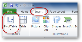
Then, from the Insert tab, click the PivotTable icon:
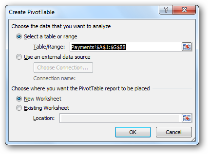
The Create PivotTable box appears, asking you two questions: What data should your new PivotTable be based on, and where should it be created? Because we already clicked on a cell within the list (in the step above), the entire list surrounding that cell is already selected for us ($A$1:$G$88 on the Payments sheet, in this example). Note that we could select a list in any other region of any other worksheet, or even some external data source, such as an Access database table, or even a MS-SQL Server database table. We also need to select whether we want our new PivotTable to be created on a new worksheet, or on an existing one. In this example we will select a new one:
The new worksheet is created for us, and a blank PivotTable is created on that worksheet:

Another box also appears: The PivotTable Field List. This field list will be shown whenever we click on any cell within the PivotTable (above):

The list of fields in the top part of the box is actually the collection of column headings from the original raw data worksheet. The four blank boxes in the lower part of the screen allow us to choose the way we would like our PivotTable to summarize the raw data. So far, there is nothing in those boxes, so the PivotTable is blank. All we need to do is drag fields down from the list above and drop them in the lower boxes. A PivotTable is then automatically created to match our instructions. If we get it wrong, we only need to drag the fields back to where they came from and/or drag new fields down to replace them.
The Values box is arguably the most important of the four. The field that is dragged into this box represents the data that needs to be summarized in some way (by summing, averaging, finding the maximum, minimum, etc). It is almost always numerical data. A perfect candidate for this box in our sample data is the “Amount” field/column. Let’s drag that field into the Values box:

Notice that (a) the “Amount” field in the list of fields is now ticked, and “Sum of Amount” has been added to the Values box, indicating that the amount column has been summed.
If we examine the PivotTable itself, we indeed find the sum of all the “Amount” values from the raw data worksheet:

We’ve created our first PivotTable! Handy, but not particularly impressive. It’s likely that we need a little more insight into our data than that.
Referring to our sample data, we need to identify one or more column headings that we could conceivably use to split this total. For example, we may decide that we would like to see a summary of our data where we have a row heading for each of the different salespersons in our company, and a total for each. To achieve this, all we need to do is to drag the “Salesperson” field into the Row Labels box:

Now, finally, things start to get interesting! Our PivotTable starts to take shape….

With a couple of clicks we have created a table that would have taken a long time to do manually.
So what else can we do? Well, in one sense our PivotTable is complete. We’ve created a useful summary of our source data. The important stuff is already learned! For the rest of the article, we will examine some ways that more complex PivotTables can be created, and ways that those PivotTables can be customized.
First, we can create a two-dimensional table. Let’s do that by using “Payment Method” as a column heading. Simply drag the “Payment Method” heading to the Column Labels box:

Which looks like this:

Starting to get very cool!
Let’s make it a three-dimensional table. What could such a table possibly look like? Well, let’s see…
Drag the “Package” column/heading to the Report Filter box:

Notice where it ends up….

This allows us to filter our report based on which “holiday package” was being purchased. For example, we can see the breakdown of salesperson vs payment method for all packages, or, with a couple of clicks, change it to show the same breakdown for the “Sunseekers” package:

And so, if you think about it the right way, our PivotTable is now three-dimensional. Let’s keep customizing…
If it turns out, say, that we only want to see cheque and credit card transactions (i.e. no cash transactions), then we can deselect the “Cash” item from the column headings. Click the drop-down arrow next to Column Labels, and untick “Cash”:

Let’s see what that looks like…As you can see, “Cash” is gone.

Formatting
This is obviously a very powerful system, but so far the results look very plain and boring. For a start, the numbers that we’re summing do not look like dollar amounts – just plain old numbers. Let’s rectify that.
A temptation might be to do what we’re used to doing in such circumstances and simply select the whole table (or the whole worksheet) and use the standard number formatting buttons on the toolbar to complete the formatting. The problem with that approach is that if you ever change the structure of the PivotTable in the future (which is 99% likely), then those number formats will be lost. We need a way that will make them (semi-)permanent.
First, we locate the “Sum of Amount” entry in the Values box, and click on it. A menu appears. We select Value Field Settings… from the menu:

The Value Field Settings box appears.

Click the Number Format button, and the standard Format Cells box appears:

From the Category list, select (say) Accounting, and drop the number of decimal places to 0. Click OK a few times to get back to the PivotTable…
As you can see, the numbers have been correctly formatted as dollar amounts.
While we’re on the subject of formatting, let’s format the entire PivotTable. There are a few ways to do this. Let’s use a simple one…
Click the PivotTable Tools/Design tab:

Then drop down the arrow in the bottom-right of the PivotTable Styles list to see a vast collection of built-in styles:

Choose any one that appeals, and look at the result in your PivotTable:

Other Options
We can work with dates as well. Now usually, there are many, many dates in a transaction list such as the one we started with. But Excel provides the option to group data items together by day, week, month, year, etc. Let’s see how this is done.
First, let’s remove the “Payment Method” column from the Column Labels box (simply drag it back up to the field list), and replace it with the “Date Booked” column:

As you can see, this makes our PivotTable instantly useless, giving us one column for each date that a transaction occurred on – a very wide table!

To fix this, right-click on any date and select Group… from the context-menu:

The grouping box appears. We select Months and click OK:

Voila! A much more useful table:

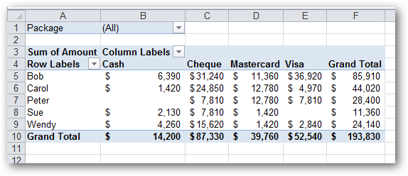
(Incidentally, this table is virtually identical to the one shown at the beginning of this article – the original sales summary that was created manually.)
Another cool thing to be aware of is that you can have more than one set of row headings (or column headings):

…which looks like this….

You can do a similar thing with column headings (or even report filters).
Keeping things simple again, let’s see how to plot averaged values, rather than summed values.
First, click on “Sum of Amount”, and select Value Field Settings… from the context-menu that appears:
In the Summarize value field by list in the Value Field Settings box, select Average:
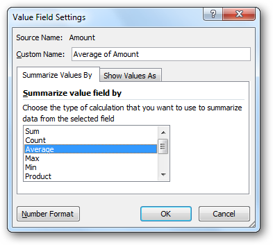
While we’re here, let’s change the Custom Name, from “Average of Amount” to something a little more concise. Type in something like “Avg”:

Click OK, and see what it looks like. Notice that all the values change from summed totals to averages, and the table title (top-left cell) has changed to “Avg”:

If we like, we can even have sums, averages and counts (counts = how many sales there were) all on the same PivotTable!
Here are the steps to get something like that in place (starting from a blank PivotTable):
- Drag “Salesperson” into the Column Labels
- Drag “Amount” field down into the Values box three times
- For the first “Amount” field, change its custom name to “Total” and it’s number format to Accounting (0 decimal places)
- For the second “Amount” field, change its custom name to “Average”, its function to Average and it’s number format to Accounting (0 decimal places)
- For the third “Amount” field, change its name to “Count” and its function to Count
- Drag the automatically created
 field from Column Labels to Row Labels
Here’s what we end up with:

Total, average and count on the same PivotTable!
Conclusion
There are many, many more features and options for PivotTables created by Microsoft Excel – far too many to list in an article like this. To fully cover the potential of PivotTables, a small book (or a large website) would be required. Brave and/or geeky readers can explore PivotTables further quite easily: Simply right-click on just about everything, and see what options become available to you. There are also the two ribbon-tabs: PivotTable Tools/Options and Design. It doesn’t matter if you make a mistake – it’s easy to delete the PivotTable and start again – a possibility old DOS users of Lotus 1-2-3 never had.
We’ve included an Excel that should work with most versions of Excel, so you can download to practice your PivotTable skills.
Download Our Practice Excel File

| Similar Articles | Productive Geek Tips |
| Latest Software Reviews | Tinyhacker Random Tips |
© How to geek or respective owner